Activity summary — what can I learn?
Written By KULG App
Last updated 3 months ago
Activity summary in the Dashboard view allows you to get a quick overview of your key volume and intensity indicators. You can choose a predefined time frame (this week/ month/ quarter/ year/ all time) or select custom dates. You can also dig deeper into these charts when filtering the activity summary by a specific type of run (e.g. tempo run, long run, etc) or another sports supported by KULG.
Here’s what you can see in the Activity summary:
select by time or type of run:
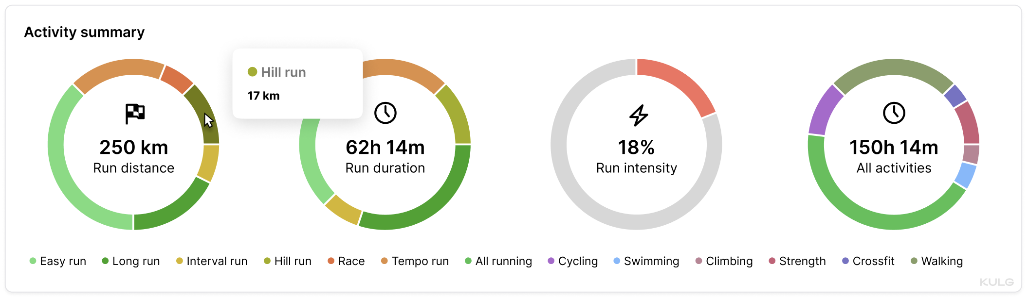
Run distance: different types of running activities by distance, summing up the total run distance
Run duration: different types of running activities by duration, summing up the total run time
Run intensity: intensity proportion of your total running distance
select by time only:
All activities: different types of cross-training by duration, summing up the total activity time (→ read more)
select another sport:
When a sport is selected, sport-specific graphs replace the default running charts
Each chart displays the selected sport in its corner for easy reference
Run distance
The first pie chart sums up the total distance covered for the selected time frame and breaks down your total run distance by types of runs (easy runs, long runs, tempo runs, interval sessions, etc). This graph provides insight into your total volume by each type of workout, helping you see where your training focus lies. By tracking the proportion of distance across different run types, you can ensure you're balancing your training and prioritising the right types of runs for your goals.
Run duration
The second pie chart shows your total run duration categorised by types of runs, offering a breakdown of how much time you’re spending in different workout intensities. This data helps you understand how your time is allocated across various run types, allowing for better planning and adjustment to ensure you're not overtraining or neglecting important training sessions. It’s a great way to monitor if you're dedicating enough time to recovery runs or focusing more on high-intensity workouts.
Run intensity
The third pie chart tracks the proportion of your runs spent at different intensities, such as easy or high-intensity efforts. By analysing the distribution of your runs based on intensity, you can assess whether you've included enough high intensity sessions into your training or if you need to dial back to prevent overtraining. This chart helps you maintain the right balance of intensity to reach peak performance without overloading your body. You can also track your intensity distribution in distance on the “Intensity” chart under Dashboard (→ read more). By selecting a specific type of run, e.g. “Hill run”, you can see how much of the total distance covered on hill runs included high intensity training.
Why runners should track 🏃♀️ volume and intensity 🔥🔥🔥
Monitoring volume (distance), intensity, and frequency is the key to ensuring consistency in running and staying clear of injuries. Runners need to track intensity % (i.e. the proportion of high intensity training from total distance) to ensure that they are not working too hard and not adding load too quickly.
Total activity time
The fourth pie chart provides a summary of your total activity time, including all running and other cross-training activities. This chart helps you see how your running time compares to other forms of exercise, offering a holistic view of your overall fitness regime. Whether you're focusing on cross-training or recovering with low-impact activities, this chart helps ensure a well-rounded fitness routine that supports your running goals.
💡 The advised proportion of hard vs easy running based on widely accepted training principles for balancing stress and recovery is up to 20% hard and 80% easy. For shorter time frames like a week it may be acceptable to have a bigger % of high intensity running - e.g. when you’re tapering and doing a race. But for longer time frames, it is better to err on the side of caution and keep the high intensity load below 20% and even around 10% during the base phase. The bigger the weekly running volume, the more relevant it is to track intensity. So, higher weekly intensity % should be an exception and is a clear risk factor when done over longer periods of time.
NB! 📍
KULG App calculates intensity based on what you have marked as “high intensity”. It let’s you track high intensity kilometres on different types of runs, so you can monitor how much of your total running volume felt hard and how much felt easy. This way you can track intensity more accurately and ensure you are not working too hard. Strides at the end of an easy run, tempo splits, short intervals, hill sprints, the high end of progression runs and races all add up, even if they are not always entirely “hard” workouts. It’s useful to develop your own consistent logic for understanding what is “hard” and what is “easy” for you but a good recommendation is that high intensity is a run done in heart rate zone 3 or above (higher than ca 80% of your maximum heart rate) or at an effort level of 6 or higher on a 10-point scale. → Read more